
Open any app and try to count them: the magnifying glass for search, the heart for favorites, the three lines of the menu, the cart. Icons are everywhere, and you understand them in a split second without reading a word.
That’s exactly why a bad icon stands out. One stroke thicker than the others, or a different corner, and the whole site looks rushed. The secret of a polished interface is a consistent icon set, and that set is almost always made of SVGs.
In this guide you’ll find a library of free SVG icons, all drawn with the same rules, and I’ll show you how to choose them, recolor them and add them to your projects, even without writing code.
Why your icons should be SVG
An icon is shown small, at 16 or 24 pixels, but on a high-density screen those pixels become two or three times as many. A PNG has to be exported in several sizes or it gets blurry. An SVG, as you saw in the guide to SVG files, stays sharp at any size with a single file.
There’s a practical bonus too: an SVG icon is tiny, often under half a kilobyte, and you can recolor it without opening a design program. That’s why the most popular icon sets on the web, for websites and apps alike, ship as SVG.
Note
A few years ago “icon fonts” were everywhere: fonts where every letter is a drawing. Today SVG is preferred: it lines up better with text, it doesn’t disappear when the font fails to load and it’s easier to make accessible to screen readers.
How to spot a good icon set
A professional set isn’t just a collection of nice drawings. It’s a system where every icon follows the same rules, so side by side they look as if they were drawn with the same pen. When you choose a set, check these four things.
- The same grid. The most common standard is 24 × 24: every icon is born in a 24-unit square, so they all take up the same space.
- The same stroke width. Usually 1.5 or 2. Mixing different strokes is the mistake people notice most.
- The same corners and line ends. All rounded or all sharp, never half and half.
- Inner padding. The drawing doesn’t touch the edges: it leaves about 2 units free, so icons look the same size even when their shapes differ.

These are exactly the rules I used to draw the icons below. On top of that, every one of them uses currentColor: it takes the color of the surrounding text, and in a moment you’ll see why that’s so handy.
The free SVG icon library
Here are 24 icons for everyday interfaces: navigation, accounts, messages, shopping, files and sharing. All on a 24 × 24 grid, with a stroke width of 2 and rounded ends. “Copy” gives you the code to paste into your page, “Download” the file.
-

Home icon -

Search icon -

Menu icon -

Close icon -

User icon -

Heart icon -

Star icon -

Notifications icon -

Email icon -

Message icon -

Calendar icon -

Clock icon -

Download icon -

Upload icon -

Share icon -

Delete icon -

Edit icon -

Lock icon -

Visible icon -

Cart icon -

Done icon -

Image icon -

Link icon -

Location icon
I created and curated every icon in this collection for this site, and they’re yours to use: in personal and commercial projects, for you or your clients, edited however you like. No credit needed, though it’s always appreciated. The only thing I ask is that you don’t resell or redistribute them as they are, on their own or in collections.
What about social media icons?
You won’t find the Instagram, Facebook or LinkedIn logos in the collection, and that’s on purpose. They’re registered trademarks: each company decides how they can be used, in which colors and how far from other elements.
The right way is to download them from the brand’s official kit, which usually already includes the SVG files and the rules to follow. You’ll find them, for example, in the brand resources of Meta (Facebook, Instagram, WhatsApp), LinkedIn, X and YouTube. Don’t redraw them and don’t change their proportions.
How to change the color of an SVG icon
You’ve picked your icon, but you need it blue, or white on a dark button. There are three ways to do it, from the quickest to the most flexible.
Without code, in a design program
Drag the SVG file into Figma, Inkscape or Illustrator, select it and change the stroke color. Then export it back to SVG. That’s the way to go if you need the icon in a presentation, a flyer or a design project.
By editing the file
Open the file in a text editor and look for stroke="currentColor". If you replace currentColor with a specific color, like #1d4ed8, the icon will always be that color, wherever you use it.
With currentColor, the professional way
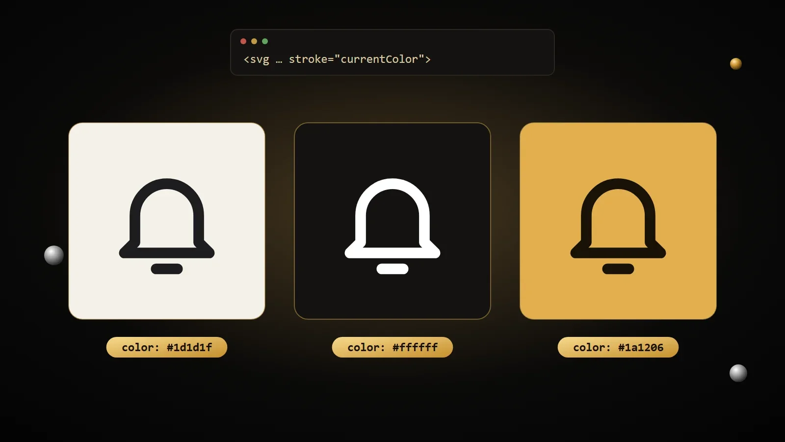
If the icon is pasted into the page’s code, keep currentColor and change only the color of the text around it. It’s what professional websites do: the icon automatically follows the color of the button, of the link on hover, and even of the dark theme.
.button {
  color: #ffffff;
}

.button:hover {
  color: #e2b04e;
}
Warning
currentColor only works when the SVG is part of the page’s code. If you use the icon with an img tag, it keeps the color written in the file and the page’s CSS can’t change it.
How to add icons to your website
For one or two icons, pasting the code where you need it is enough. When there are many, a “sprite” makes more sense: a single file that holds them all, which you call by name.
Pasted into the code
Copy the icon from the library and paste it into your HTML, next to the text it goes with. You set its size with width and height, or from your CSS.
<a href="/cart/" class="icon-link">
  <svg viewBox="0 0 24 24" width="20" height="20" fill="none" stroke="currentColor"
       stroke-width="2" stroke-linecap="round" stroke-linejoin="round" aria-hidden="true">
    <circle cx="9.5" cy="20" r="1.5" />
    <circle cx="17" cy="20" r="1.5" />
    <path d="M3 4h2.5l2.3 11.2a1 1 0 0 0 1 .8h9a1 1 0 0 0 1-.8L20.5 8H6.3" />
  </svg>
  Cart
</a>
With a sprite: every icon in one file
Put each icon inside a named symbol element, collect them in one file and call them with use. The browser downloads the file once and reuses it across the whole site.
<!-- icons.svg -->
<svg xmlns="http://www.w3.org/2000/svg">
  <symbol id="search" viewBox="0 0 24 24" fill="none" stroke="currentColor" stroke-width="2">
    <circle cx="10.5" cy="10.5" r="6.5" />
    <path d="m15.5 15.5 5 5" stroke-linecap="round" />
  </symbol>
</svg>

<!-- in the page -->
<svg width="20" height="20" aria-hidden="true">
  <use href="/icons.svg#search" />
</svg>
The sprite file has to live on the same domain as your site: for security reasons, browsers won’t load a sprite hosted on another site through use.
Size and alignment
A simple trick: size the icon in em. That way it grows and shrinks together with the text next to it.
.icon-link {
  display: inline-flex;
  align-items: center;
  gap: 0.5em;
}

.icon-link svg {
  width: 1.25em;
  height: 1.25em;
}
Accessible icons: two rules to remember
Someone using a screen reader doesn’t see the icon: they hear what the code tells them. Two rules are all you need to get it right.
- If there’s already text next to it, the icon is decorative: add
aria-hidden="true"so it isn’t read twice. - If the icon stands alone, like the magnifying glass on a search button, the button needs a name: use
aria-label="Search"on the button.
Think about fingers too: the icon can be small, but the area you tap can’t. The W3C accessibility guidelines ask for at least 24 × 24 pixels, and Apple and Google recommend 44 or 48 pixels for tappable buttons.
From icon to favicon in a minute
Any icon in the library can become your site’s favicon, the tiny icon shown in the browser tab. Download the SVG, change its color if you like, and upload it to the generator: it prepares every size you need, including the ones for iPhone and Android.

Frequently asked questions
Can I use free SVG icons for client work?
It depends on the license, so always read it. The ones on this page, yes: you can use them in commercial projects and for clients. Other sets ask you to credit the author, or don’t allow commercial use.
How do I change the color of an SVG icon?
If the icon is in the page’s code and uses currentColor, change the color of the surrounding text. Otherwise open the file and replace the color in stroke or fill, or edit it in Figma, Inkscape or Illustrator.
What size should an icon be?
Interface icons are almost always drawn on a 24 × 24 grid and shown between 16 and 32 pixels. More important than the size is the clickable area around it: at least 24 pixels, ideally 44.
Can I use social media logos on my website?
Yes, to link to your profiles, but take them from the brand’s official kit and follow its rules: no made-up colors, no distortion and no changes to the design.
SVG icons or icon fonts?
SVG, today. They’re sharper, line up better with text, don’t depend on a font loading and are simpler to make accessible.
How do I add an SVG icon in WordPress?
For security reasons, WordPress doesn’t allow SVG uploads. You can paste the icon’s code into a “Custom HTML” block, or install a plugin like Safe SVG, which cleans the files before accepting them.
Sources and further reading
- MDN Web Docs: the symbol element
- MDN Web Docs: the use element
- MDN Web Docs: aria-hidden
- W3C: Target Size (Minimum), WCAG 2.2
- W3C: decorative images
Icons are perfect for buttons and navigation. But you don’t always need a drawing: an arrow, a ©, a heart or the euro sign already exist as text characters, and you can write them straight into your HTML. In the next article you’ll find the complete HTML entities cheat sheet, with every symbol ready to copy.
Comments
No comments yet. Leave the first one!
Leave a comment